August 24, 2026
How the Animations on This Site Work
I get questions about the animations on this site fairly often, so I wanted to explain how they work.
The site uses Framer Motion, a React library that makes it easier to animate elements without having to write everything from scratch.
The basic idea: motion.div
Framer Motion includes animated versions of regular HTML elements. For example, instead of using a normal div, you can use a motion.div:
<motion.div
  initial={{ opacity: 0, y: 24 }}
  animate={{ opacity: 1, y: 0 }}
  transition={{ duration: 0.5 }}
/>
In this example:
initialsets the starting position and opacity.animatedescribes where the element should end up.transitioncontrols how quickly it gets there.
Most of the animations on this site are built from that same basic pattern.

Sections fading in while scrolling
The sections on the home page, like Skills, Experience, and Projects, fade in as they enter the screen.
I use a small reusable component called Reveal:
<Reveal>
<h2>Skills & technology</h2>
</Reveal>The component uses whileInView to wait until the element is visible:
<motion.div
  initial="hidden"
  whileInView="visible"
  viewport={{ once: true, margin: "-80px" }}
/>
whileInView is what does the actual waiting. Framer Motion watches the element and only switches it to "visible" once it scrolls into the browser window. Before that, it just sits in its "hidden" state (invisible, shifted down).
The viewport object is what fine-tunes that behavior, and it's worth breaking down:
once: true: play the animation the first time the section shows up, then leave it alone. Without this, the fade would replay every single time you scrolled the section in and out of view, which gets distracting fast.margin: "-80px": this shrinks the area that counts as "visible" by 80 pixels on every side, kind of like a hidden buffer zone at the edge of the screen. In practice it means the section has to scroll a little further into view before the animation triggers, instead of firing the instant one pixel peeks over the bottom edge of the window. It's a small trick to make sure sections trigger only once you're actually about to read them, not the second they technically exist on screen.
The fade settings are kept in one shared place, which helps the different sections feel consistent.
Here's the whole Reveal component, start to finish:
"use client";

import { motion } from "framer-motion";
import { fadeInUp, staggerContainer } from "@/components/motion/variants";

export function Reveal({ children, className, stagger = false }) {
  return (
    <motion.div
      className={className}
      initial="hidden"
      whileInView="visible"
      viewport={{ once: true, margin: "-80px" }}
      variants={stagger ? staggerContainer : fadeInUp}
    >
      {children}
    </motion.div>
  );
}

export function RevealItem({ children, className }) {
  return (
    <motion.div className={className} variants={fadeInUp}>
      {children}
    </motion.div>
  );
}
That's really the whole thing: one motion.div wrapping whatever you pass into it, with the initial/whileInView/viewport settings from above baked in so nobody has to retype them for every section. The only thing that changes based on the stagger prop is which variants object it uses: fadeInUp (a plain single fade) or staggerContainer (a fade that also staggers its children).
RevealItem is the sibling component used for the staggered cases. It's an even simpler motion.div. It doesn't set initial or whileInView itself; it just carries the fadeInUp variant and waits to be told what to do. When you nest RevealItems inside a Reveal stagger, the parent's "hidden" / "visible" state automatically flows down to every RevealItem child, because Framer Motion propagates variant state through the component tree on its own. That's the same parent-to-child cascade covered in the staggering section above; RevealItem is just what the "child" side of that relationship looks like in code.
Elements appearing one at a time
Some sections, like Projects and Experience, animate their items in one after another instead of all at once. That's called staggering, and it uses the same Reveal component from above, just with a stagger option turned on:
<Reveal stagger>
  {/* project cards */}
</Reveal>
A parent element controls the timing:
const staggerContainer = {
  visible: { transition: { staggerChildren: 0.1 } },
};
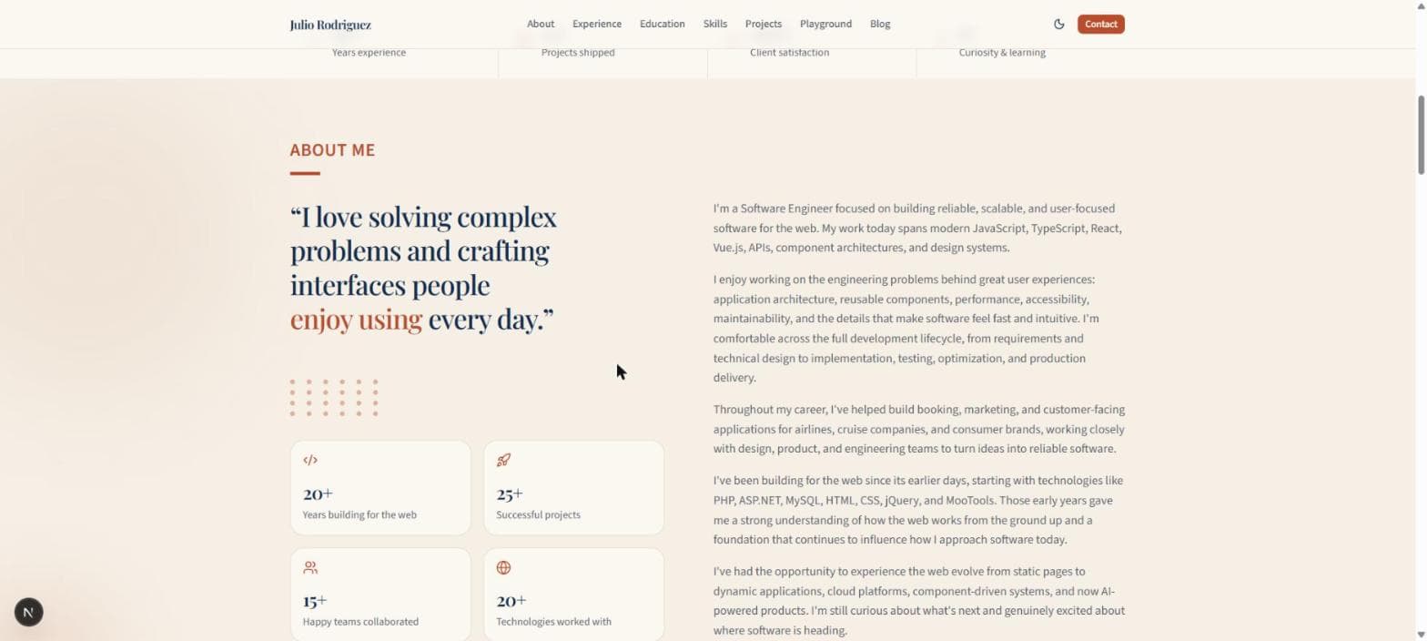
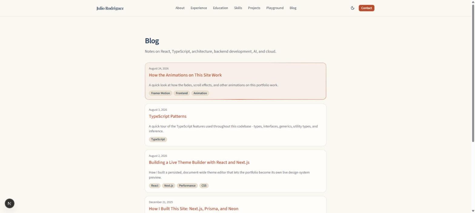
Each child still uses its own fade-in animation, but the parent adds a short delay before starting the next one, so the cards appear left to right (or top to bottom) instead of all at once. The small stat cards in the About Me section use the same trick, and so does the list of posts on the blog page.
The photo moving as you scroll
The photo in the hero section and the card beside it move at slightly different speeds as you scroll. This creates a simple parallax effect.
Framer Motion tracks the scroll position and maps it to a movement range:
const { scrollYProgress } = useScroll({ target: imageRef });
const imageY = useTransform(scrollYProgress, [0, 1], [-90, 90]);
Breaking that second line down, useTransform takes three things: a value to watch (scrollYProgress), an input range, and an output range. Here it's saying "when scrollYProgress goes from 0 to 1, take imageY from -90 to 90." So as scrollYProgress climbs from 0 (top of the section) to 1 (bottom of the section), imageY climbs right alongside it, from -90 pixels up to 90 pixels down. That imageY value then gets plugged straight into the photo's style, so the photo physically shifts as those numbers change.
The card next to the photo uses the same setup, but with the range flipped: [90, -90] instead of [-90, 90]. So while the photo drifts downward as you scroll, the card drifts upward by the same amount. Photo and card moving in opposite directions at the same time is what sells the "sitting at different depths" illusion. Nothing fancy, just two elements reading the same scroll number and reacting to it differently.
The parallax effect is also disabled when someone has reduced motion enabled in their system settings. In that case, the image stays still.

Panels that open and close
The project cards and experience cards have a "read more" button that expands a hidden bit of text. That uses a small reusable Collapse component:
const [open, setOpen] = useState(false);

<button onClick={() => setOpen((value) => !value)}>Read more</button>

<Collapse open={open}>
  <p>The extra description text.</p>
</Collapse>
So the actual trigger here is nothing fancy: a click handler flips a boolean in useState. Framer Motion doesn't know anything about buttons or clicks; it just reacts to that open value changing, the same way Reveal reacts to scroll position and the hero's parallax reacts to scrollYProgress. That's a pattern worth noticing: every animation on this site is really just Framer Motion watching some value (a boolean, a scroll number, whether an element is on screen) and smoothing out the transition whenever that value changes.
Inside Collapse, the actual animating happens with AnimatePresence:
<AnimatePresence initial={false}>
  {open && (
    <motion.div
      initial={{ height: 0, opacity: 0 }}
      animate={{ height: "auto", opacity: 1 }}
      exit={{ height: 0, opacity: 0 }}
    />
  )}
</AnimatePresence>
Normally, the moment open turns false, React would rip that element out of the page instantly. No animation, it's just gone. AnimatePresence is what stops that: it notices the element is about to be removed, plays its exit animation first, and only actually removes it from the page once that finishes. That's the whole difference between a panel that snaps shut and one that folds closed smoothly.
Here's the full component, not just the snippet:
"use client";

import { AnimatePresence, motion } from "framer-motion";
import { cn } from "@/lib/utils";

export function Collapse({ open, children, className }) {
  return (
    <AnimatePresence initial={false}>
      {open && (
        <motion.div
          initial={{ height: 0, opacity: 0 }}
          animate={{ height: "auto", opacity: 1 }}
          exit={{ height: 0, opacity: 0 }}
          transition={{ duration: 0.22, ease: "easeOut" }}
          className={cn("overflow-hidden", className)}
        >
          {children}
        </motion.div>
      )}
    </AnimatePresence>
  );
}
A few details worth pointing out that don't show up in the shorter snippet above:
initial={false}onAnimatePresence(not on the innermotion.div) tells Framer Motion "don't play an entrance animation the very first time this mounts." Without it, a card that starts out already expanded would visibly animate open on page load, which looks like a glitch rather than an intentional entrance.overflow-hiddenon the wrappingclassNameis doing quiet but essential work: animatingheightonly looks right if the content is clipped while the box is shrinking. Without it, the text would just sit there unclipped while the box shrinks underneath it, which looks broken.- The
childrenprop is just whatever gets passed between<Collapse>and</Collapse>.Collapsedoesn't know or care what's inside; it only manages the box that content sits in.
So open is the one piece of state the whole component revolves around: a plain true/false boolean living in whatever component renders the Collapse, flipped by a button's onClick. Everything else, the height animation, the fade, the exit timing, is Collapse reacting to that single value changing.

Cards that glow around the edge on hover
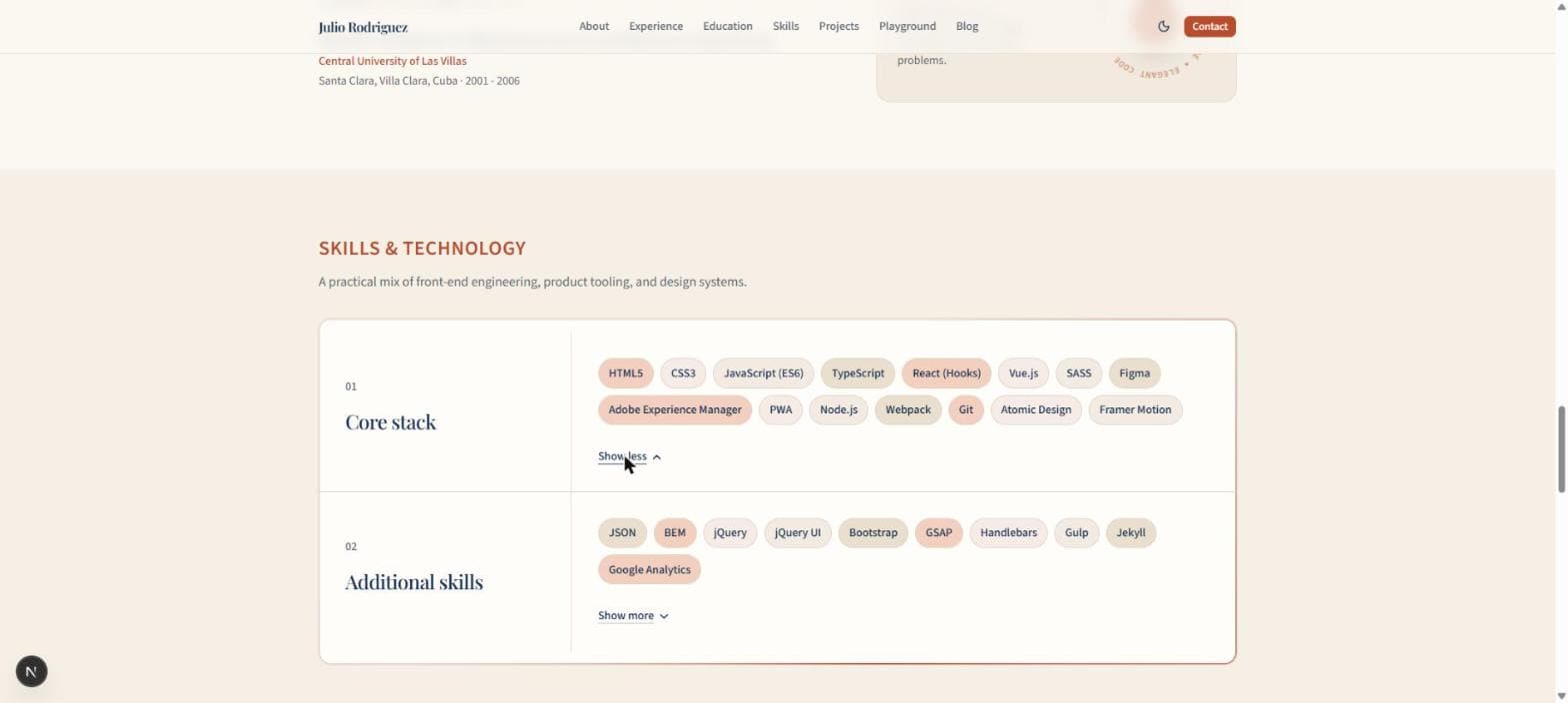
The project cards have a soft gradient outline that appears and slowly spins when you hover over them. That one's actually not Framer Motion at all. It's plain CSS, using a class called gradient-border:
.gradient-border::before {
  background: conic-gradient(from var(--gradient-border-angle), var(--primary), transparent, var(--primary));
  opacity: 0;
  transition: opacity 0.35s ease;
}

.gradient-border:hover::before,
.gradient-border:focus-visible::before {
  opacity: 1;
  animation: gradient-border-spin 2.5s linear infinite;
}

@keyframes gradient-border-spin {
  to { --gradient-border-angle: 360deg; }
}
Here's what's actually going on: ::before creates an invisible extra layer sitting just behind the card, shaped like a thin outline (a mask trick cuts a card-shaped hole out of the middle, so only the edge shows). That outline is painted with a conic-gradient, a gradient that sweeps around in a circle rather than in a straight line, like a color wheel. Normally it's invisible (opacity: 0). The moment you hover or focus the card, it fades in and starts spinning, because the gradient-border-spin animation slowly rotates the gradient's angle from 0 to 360 degrees on a loop.

It's a nice example of the two tools working together, not against each other: Framer Motion handles animations tied to React state (scroll, clicks, visibility), while this one is a pure CSS :hover effect that doesn't need any JavaScript at all. Both respect reduced-motion: the CSS version turns the spin off with a @media (prefers-reduced-motion: reduce) rule, the same idea as useReducedMotion() on the Framer Motion side, just written for plain CSS instead.
The spinning "clean code" badge
The Education section has a small circular badge that spins slowly on its own, forever, with text curving around the ring. This one isn't triggered by anything. No scroll, no hover, no click. It just runs.

It's built from two pieces: an SVG with text following a circular path, and a plain CSS animation spinning the whole SVG.
<svg viewBox="0 0 200 200">
<path id="code-ring-path" fill="none" d="M 100,100 m -84,0 a 84,84 0 1,1 168,0 a 84,84 0 1,1 -168,0" />
<text>
<textPath href="#code-ring-path">
CLEAN CODE • ELEGANT CODE • CLEAN CODE • ELEGANT CODE •
</textPath>
</text>
</svg>The path here is invisible (fill="none"), it's just a circle drawn with SVG's arc syntax, used purely as a guide rail. textPath is the actual trick: instead of writing text in a straight line, it tells the browser to bend that text along the shape of a path, letter by letter. The text is repeated a few times back to back so the ring never shows an empty gap.
The spinning itself is a two-line CSS animation on the SVG element:
.code-ring-svg {
  animation: code-ring-spin 48s linear infinite;
}

@keyframes code-ring-spin {
  from { transform: rotate(0deg); }
  to { transform: rotate(360deg); }
}
infinite means it never stops, and 48s is deliberately slow: a full rotation takes 48 seconds, so it reads as a calm, ambient detail rather than something demanding attention. The little code icon sitting in the center of the ring is a separate, absolutely positioned element that doesn't rotate at all, so it stays upright the whole time while the text spins around it.
This is the simplest animation on the whole site, and worth noticing for that reason: no Framer Motion, no state, no trigger. Just a shape, some text bent onto it, and one CSS @keyframes rule looping forever.
Keeping the animation code manageable
There are a few things that keep the animation code from being repeated everywhere:
- The shared fade settings are stored in one place.
RevealandCollapsehandle the patterns that get used repeatedly.- Motion is disabled for people who have enabled reduced motion, whether it's a Framer Motion animation or a plain CSS one like the gradient border.
The site doesn't use a huge animation system. Most of it comes down to a few Framer Motion settings, initial, animate, and whileInView, with useScroll and useTransform added for the scrolling effects, plus a couple of small CSS-only effects for the hover glow and the spinning badge. Every one of them is triggered by something simple: a scroll position, a click, the mouse hovering a card, or nothing at all.
If you're learning Framer Motion, simple fade-ins are a good place to start. Once those make sense, scroll-based effects are easier to understand.